Examples#
The following set of instructions is a step-by-step guide to reproduce the result in [2], which is an example of using restoreio.
Dataset#
The paper uses the HF radar dataset from the Monterey Bay region in California, USA. The HF radar can be accessed publicly through the national HF radar network gateway maintained by the Coastal Observing Research and Development Center. Please follow these steps to obtain the data file.
Dataset Webpage: The studied data is available through its OpenDap page. In particular, the OpenDap URL of this dataset is
http://hfrnet-tds.ucsd.edu/thredds/dodsC/HFR/USWC/2km/hourly/RTV/HFRADAR_US_West_Coast_2km_Resolution_Hourly_RTV_best.ncd
Navigate to Dataset Webpage: To navigate to the above webpage, visit CORDC THREDDS Serever. From there, click on HF RADAR, US West Coast, and select HFRADAR US West Coast 2km Resolution Hourly RTV and choose Best Time Series.
Subseting Data: The above dataset contains the HF radar covering the west coast of the US from 2012 to the present date with 2km resolution and hourly updates. In the examples below, we focus on a spatial subset of this dataset within the Monterey Bay region for January 2017.
Reproducing Results#
The scripts to reproduce the results can be found in the source code of restoreio under the directory /examples/uncertainty_quant.
Reproducing Figure 1#
python plot_gdop_coverage.py
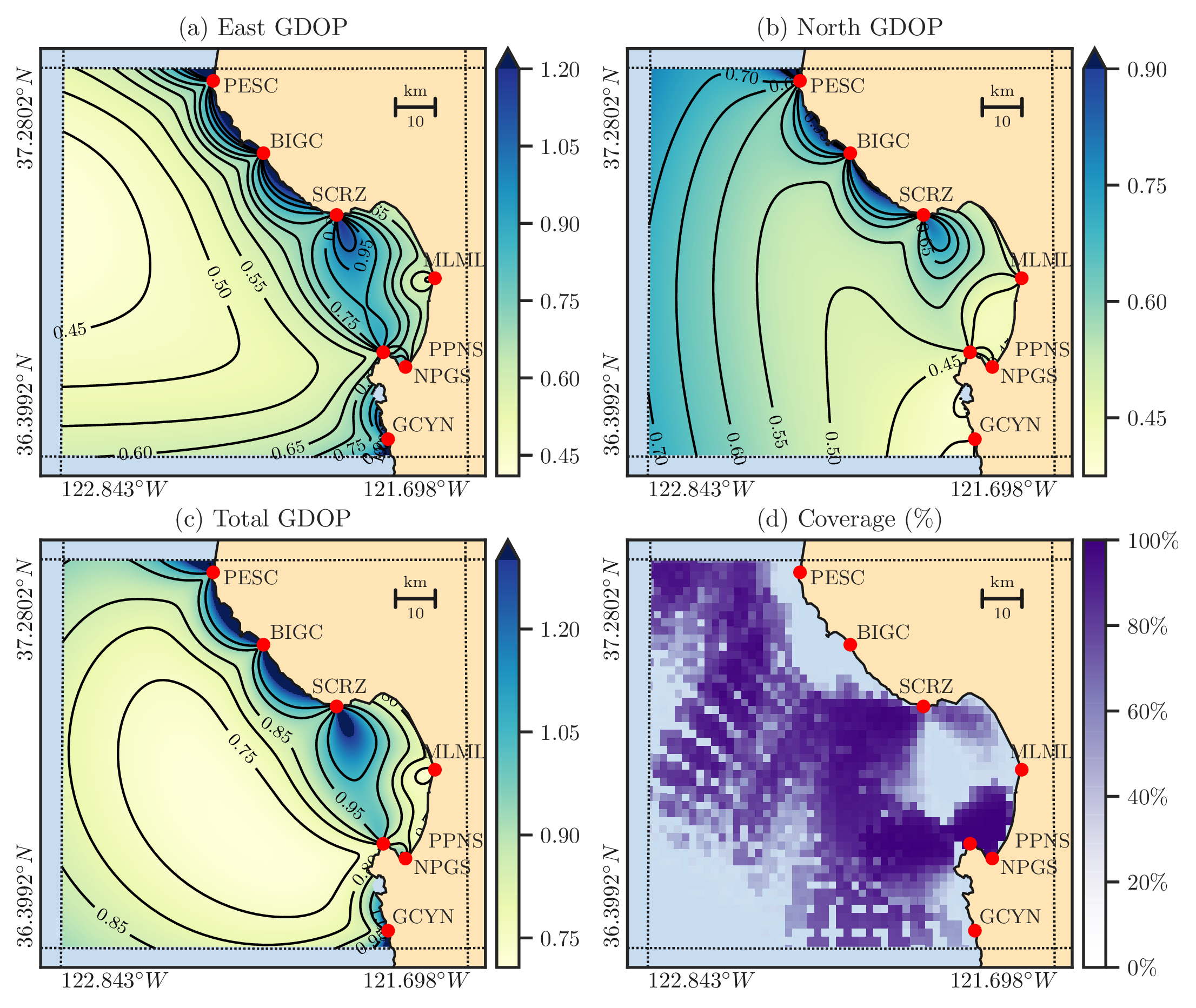
Figure 1: Panels (a) and (b) display the east and north GDOP values, respectively, calculated along the northern California coast using the radar configurations indicated by the red dots and their corresponding code names. Panel (c) shows the total GDOP, which is a measure of the overall quality of the estimation of the velocity vector. Panel (d) represents the average HF radar data availability for January 2017, indicating the locations with missing data that generally correspond to high total GDOP values.#
Reproducing Figure 2 to Figure 9#
python restoreio_mwe.py
The above python script executes the following lines of code, which is given in Listing 1 of the manuscript. Users may change the settings in the function arguments below. For further details, refer to the API reference documentation of the function restoreio.restore() function.
>>> # Install restoreio with: pip install restoreio
>>> from restoreio import restore

>>> # OpenDap URL of the remote netCDF data
>>> url = 'http://hfrnet-tds.ucsd.edu/thredds/' + \
...       'dodsC/HFR/USWC/2km/hourly/RTV/HFRAD' + \
...       'AR_US_West_Coast_2km_Resolution_Hou' + \
...       'rly_RTV_best.ncd'

>>> # Generate ensemble and reconstruct gaps
>>> restore(input=url, output='output.nc',
...         min_lon=-122.344, max_lon=-121.781,
...         min_lat=36.507, max_lat=36.992,
...         time='2017-01-25T03:00:00',
...         uncertainty_quant=True, plot=True,
...         num_samples=2000, ratio_num_modes=1,
...         kernel_width=5, scale_error=0.08,
...         detect_land=True, fill_coast=True,
...         write_samples=True, verbose=True)
The above script generates the output file output.nc that contains all generated ensemble. Moreover, it creates a subdirectory called output_results and stores Figure 2 to Figure 9 of the manuscript. These plots are shown below.
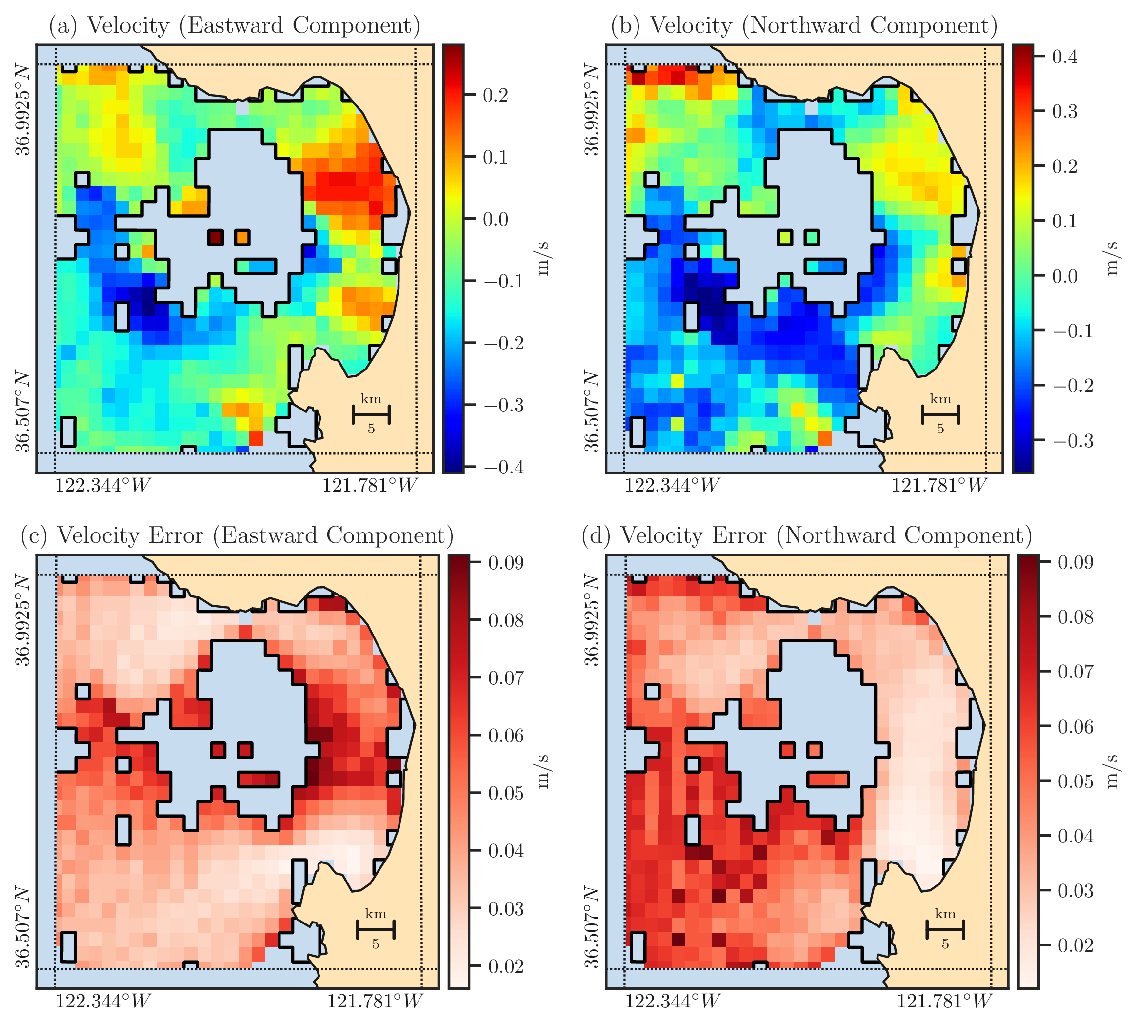
Figure 2: Panels (a) and (b) show the east and north components of the ocean’s current velocity as measured by HF radars in Monterey Bay on January 25-th, 2017, at 3:00 UTC. The regions inside the solid black curves represent missing data that was filtered out due to high GDOP values from the original measurement. Panels (c) and (d) respectively show the east and north components of the velocity error computed for the locations where velocity data is available in Panels (a) and (b).#

Figure 3: The red fields represent the calculated spatial autocorrelation α for the east (a) and north (b) velocity data. The elliptical contour curves are the best fit of the exponential kernel \(\rho\) to the autocorrelation. The direction of the principal radii of ellipses is determined by the eigenvectors of \(\boldsymbol{M}\), representing the principal direction of correlation. The radii values are proportional to the eigenvalues of \(\boldsymbol{M}\), representing the correlation length scale. The axes are in the unit of data points spaced 2 km apart.#
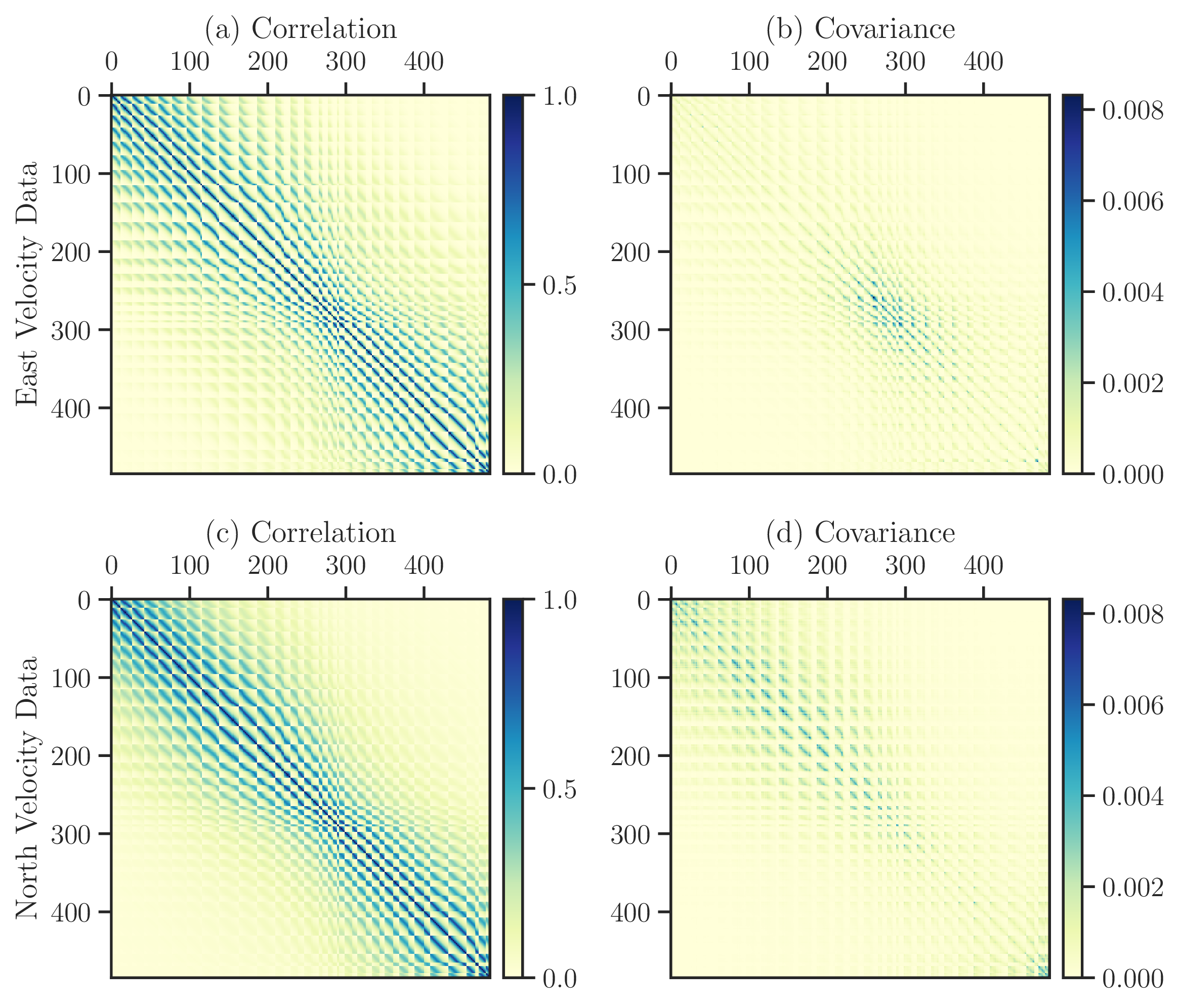
Figure 4: Correlation (first column) and covariance matrices (second column) of the east (first row) and north (second row) datasets are shown. The size of matrices are \(n = 485\).#
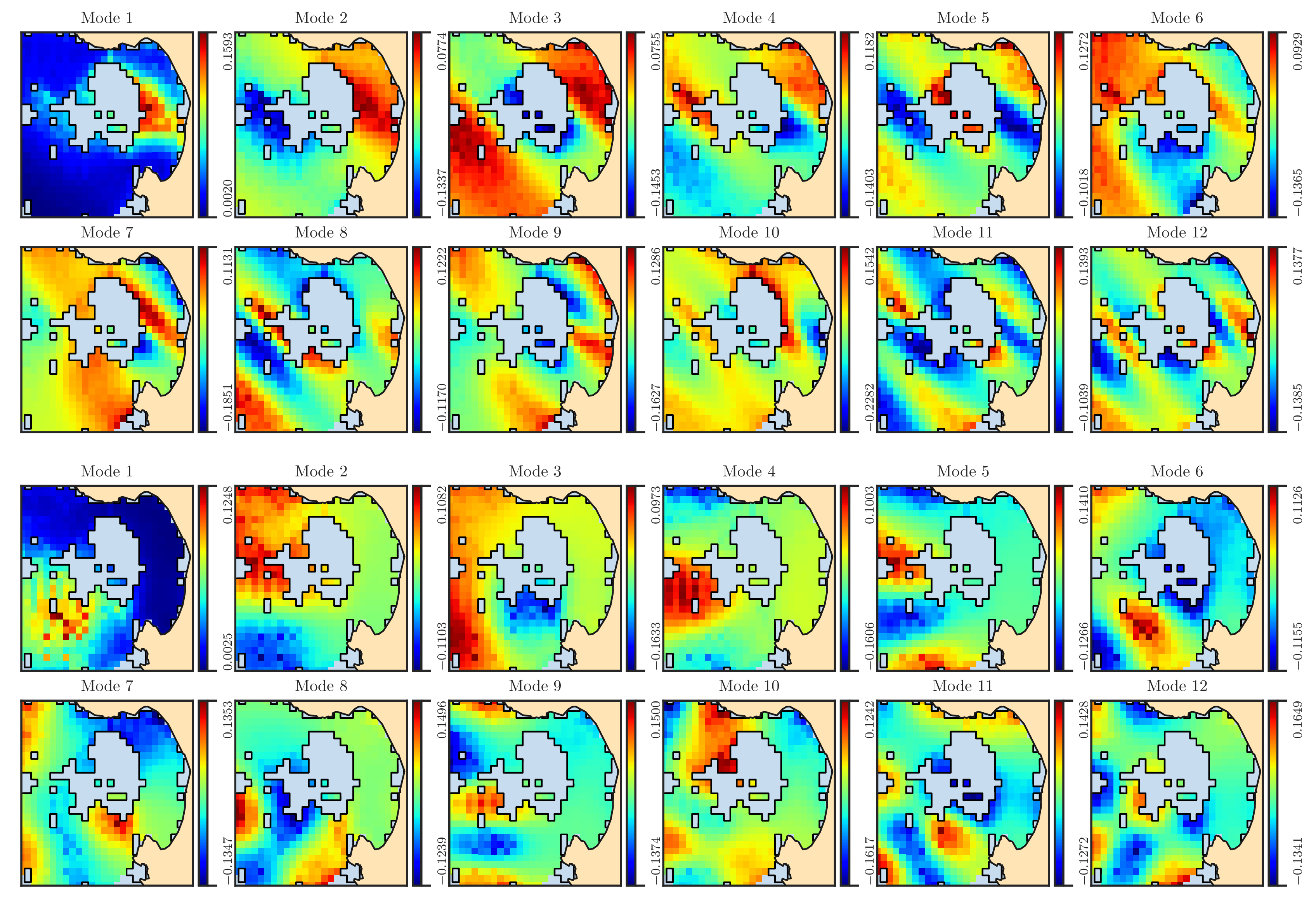
Figure 5: The first 12 spatial eigenfunctions \(\phi_i\) for the east velocity dataset (first and second rows) and north velocity dataset (third and fourth rows) are shown in the domain \(\Omega\) in the Monterey Bay. The black curves is indicate the boundary of the missing domain \(\Omega_{\circ}\). We note that the oblique pattern in the east eigenfunctions is attributed to the anisotropy of the east velocity data, as illustrated in Figure 3a.#
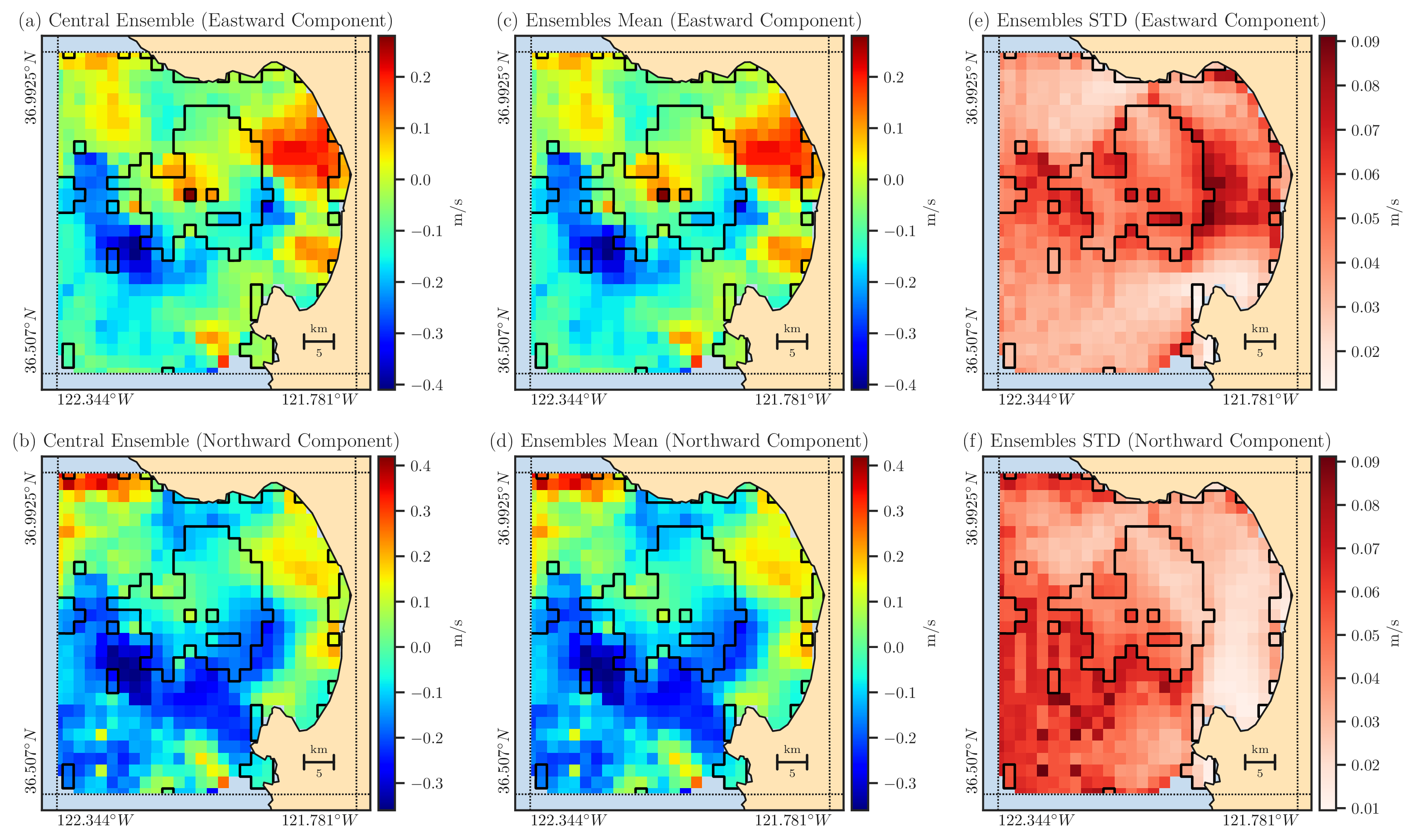
Figure 6: The reconstructed central ensemble (first column), mean of reconstructed ensemble (second column), and the standard deviation of reconstructed ensemble (third column) are shown in both \(\Omega\) and \(\Omega_{\circ}\). The boundary of \(\Omega_{\circ}\) is shown by the solid black curve. The first and second rows correspond to the east and north velocity data, respectively.#

Figure 7: The left to right columns show the plots of deviations \(d_1(\boldsymbol{x})\), \(d_2(\boldsymbol{x})\), \(d_3(\boldsymbol{x})\), and \(d_4(\boldsymbol{x})\), displayed in both domains \(\Omega\) and \(\Omega_{\circ}\) with the first and second rows representing the east and north datasets, respectively. The solid black curve shows the boundary of \(\Omega_{\circ}\). The absolute values smaller than \(10^{-8}\) are rendered as transparent and expose the ocean background, which includes the domain \(\Omega\) for the first three deviations.#

Figure 8: The JS distance between the expected distribution \(q(\boldsymbol{x}, \xi)\) and the observed distribution \(p(\boldsymbol{x}, \xi)\) is shown. The absolute values smaller than \(10^{-8}\) are rendered as transparent and expose the ocean background, which includes the domain \(\Omega\) where the JS distance between \(p(\boldsymbol{x}, \xi)\) and \(q(\boldsymbol{x}, \xi)\) is zero.#
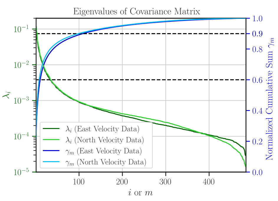
Figure 9: The eigenvalues \(\lambda_i\), \(i = 1, \dots , n\) (green curves using left ordinate) and the energy ratio \(\gamma_m\), \(m = 1, \dots , n\) (blue curves using right ordinate) are shown for the east and north velocity data. The horizontal dashed lines correspond to the 60% and 90% energy ratio levels, respectively, which equate to utilizing nearly 10 and 100 eigenmodes.#
Reproducing Figure 10#
First, run
plot_js_divergence.shscript:bash plot_js_divergence.shThe above script creates a directory called
output_js_divergenceand stores the output filesoutput-001.nctooutput-200.nc.Next, run
plot_js_divergence.pyscript:python plot_js_divergence.py

Figure 10: The JS distance between the probability distributions \(p_m(\boldsymbol{x}, \xi)\) and \(p_n(\boldsymbol{x}, \xi)\) is shown as a function of \(m = 0, \dots , n\). These two distributions correspond to the ensemble generated by the \(m\) term (truncated) and \(n\) term (complete) KL expansions, respectively. We note that the abscissa of the figure is displayed as the percentage of the ratio \(m/n\) where \(n = 485\).#
Reproducing Figure 11#
Run plot_vel_distribution.py script:
python plot_vel_distribution.py
The above script creates the following plot:
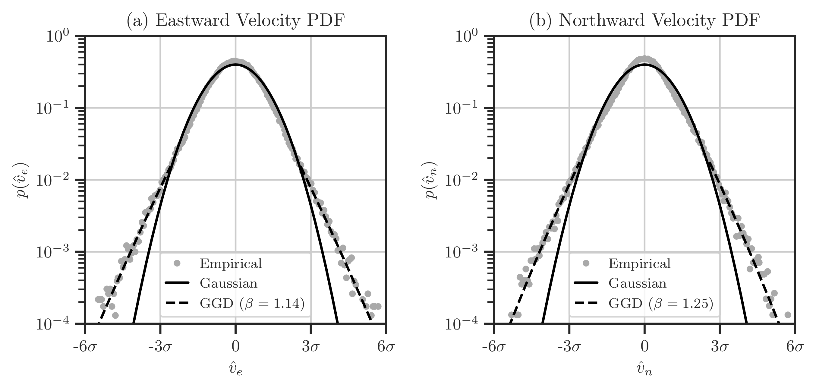
Figure 11: Probability density functions of the east (a) and north (b) components of velocity data for January 2017. Circle points denote the empirical PDF, the solid black curve indicates the standard normal distribution \(\mathcal{N}(0, 1)\), and the dashed black curve shows the best-fit generalized Gaussian distribution (GGD) with the density function \(p(v) \propto \exp(-\vert v \vert^{\beta})\). The abscissa in both figures represents the normalized velocity components, with \(\sigma\) being the standard deviation of the respective data.#